Friday, May 28, 2010

Pigtails & Pixies LOGO

recently i was asked to help design a logo for "Pigtails & Pixies Bowtique", custom made accessories for head to toe, specializing in hair bows (and tutus) for little girls.

you can see Erin's amazing work on her BLOG, and you can always buy lots of great products for the little ones in your life at ETSY or ARTFIRE

some fun first tries:
(you can always click for larger view if you like)


the final "banner" i made looks a bit like a clothing tag.
i had fun playing with the dotted line in stitches and cartoon flutters:

add glitter...


Thursday, May 27, 2010

Derek and the Darling LOGOS

i don't know how i'm always lucking out working with the nicest people ever, but NYC's rock n' roll dance outfit "Derek and the Darling" presented me with the fun challenge of helping them with a new logo as they embark on tours and record releases all this year.


I wanted to find them something clean, sleek, and smooth to both match their style (as well as avoid anything looking too dated in a year), and something that would be fun and modern (but referenced their music too), not to mention match the enthusiasm of their personalities.

i believe in options, something i've been told is a bit of a designer no-no. sometimes i think it may be my lack of confidence in my design skills or sensibility, but other times i know that i'm the kind of person who can tell you what i don't like before i can tell you what i do like, and most times i have to see it first anyway. i think a lot of folks are like this, and the bottom line is, if i'm going to honor the compliment of being asked to work on something For You, i'm going to make sure it's done For You. i know it's supposed to be "up to you as a designer" to fine tune and craft a vision, but it's not entirely my decision is it; i'm just an interpreter and vessel.

i like options, i love exploration, and i'm all about collaboration with the client to give them something they will be a million % excited about. i've worked at companies that didn't care enough about the customer, client, or product, and the end results were never great, and never ever long lasting. so here i tend to bombard folks with a ton of (appropriate) typefaces first, thinking of them (and rocking out to their music) the entire time, and we narrow it down quickly and collectively. we start wide and chop 90%, and then dive into the details, where i tend to thrive. we actually staid pretty true to the various typefaces and pictorial ideas, with only minor tweaks to match the same precision their music has. here are just a few:


in the end we took a crucial roundabout journey to come back to a place where we started, wiser and more fine tuned than before! you can see how they used their new logo on FACEBOOK as well asMYSPACE, and of course on tour and on record now!

Monday, May 24, 2010

Death Gospel


yes indeed you may have heard pieces of Adam Arcuragi's rousting hootenanny "Bottom Of The River" on TV recently (that's me playing harmonica!)

congrats to Adam and the entire Lupine Chorale Society!

now get out there and see Adam LIVE (because he is amazing live), or head over to High Two Records, or wherever fine music is sold, and grab a copy of Adam's live-take, feel-great, long-player: "I Am Become Joy". we all enjoyed making it, we know you'll enjoy listening to it


Friday, May 21, 2010

oh boy! new records!

and they came out great!


for the record:
1) Paper+Plastick Records is one of the best things to happen to music. period.

2) Coffee Project are two of the coolest dudes ever, and i'm SO proud to get to be a part of what they are doing. their show last night in NYC at The Silent Barn knocked my socks off, and their excellent new songs are full of so much heart-tugging & humor. you really need to see them on tour, as intimate a setting as possible, and be simultaneously spellbound and pumped by the cleverness of every aspect of the songwriting. Their first full-length LP "Moved On" is OUT NOW!

3) The Blacklist Royals bowled us all over. spirited, rebellious, & passionate anthems as heavy and driving as the motor on a '59 Buick Electra (you can hear some HERE). such rad generous guys too; really appreciated getting to spend time with them, and now triple-proud to have gotten to work with such a great band

4) Greenland Is Melting. phew, i was not ready. the most passionate bluegrass music you have ever heard. like the sweetest honey drizzled over your first heartbreak. i didn't get to do any art for them --- because the amazing Shaun Pereira did (and you have to buy this LP and unfold it's vertical Andrew-Wyeth-meets-Steadman+Burton glory)! head over to P+P HERE to download the record FOR FREE if you don't believe me. you'll be giving them your hard earned whiskey money like i did. have i mentioned Karl, Will & Shaun (whose name i misspelled on my card, sorry) are the nicest guys ever?

-------------------

Zounds! check out this great tour video from Jake & Buddy, and the super nice shout out they gave me towards the end! this gives a great snapshot of one of the best shows/nights ever! (why, that's even my noodle on the bottom right of the preview!)

Friday, April 2, 2010

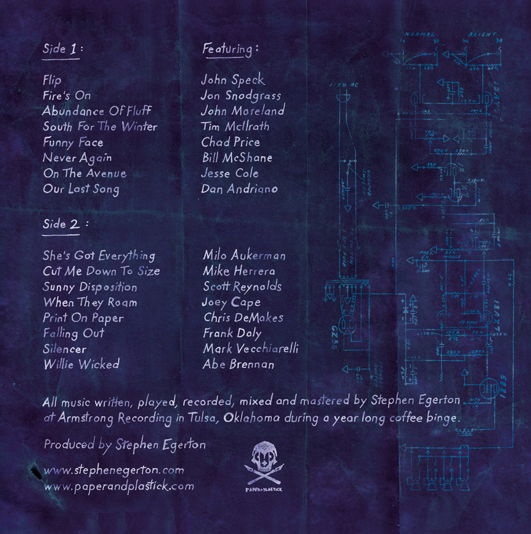
the Seven Degrees of Stephen Egerton!


i just got to work with renaissance man Stephen Egerton, known especially for his influential guitar work in The Descendents and ALL ! In addition to being one of the nicest guys on the planet, he recently wrote and recorded a record at his own Armstrong Recording studios, and he has a real 'whos-who' of punk rock all stars doing guest vocals (we're talking The Descendents, ALL, Alkaline Trio, MXPX, Less Than Jake, Big Drill Car, Rise Against, Ultimate Fakebook, Lagwagon, Shades Apart, Drag The River, and way more! phew!)

The album will be out proudly on Paper+Plastick Records May 11th, with what i can only imagine will be one of the coolest record release shows ever (with vocalists confirmed) May 14th & 15th. The LP will feature Stephen's logo, designed by the awesome Eli Atkins, as a die-cut window !)

i don't think i have to tell you how excited i was to be working with Stephen here.
legendary!


(all type done by hand)

Monday, March 22, 2010

Coffee Project

so Paper+Plastick's COFFEE PROJECT (featuring members of Less Than Jake & Rehasher) asked if i would do the art and layout for their second record, and what a compliment to be asked a second time!

they said they wanted "Peter Wonsowski meets Dr Seuss"; how great is that to hear?!? and of course i love that my job includes a morning reading 7 of my favorite Dr Seuss story books for, you know, "reference" (not to mention my trip to the book store a Tax Write Off !)


the following were rough thumbnail sketches, to determine what kind of perspective we wanted


followed by some quick fleshing out before i dove into the exploration of the final


and since many drawings would be of actual band members, guest musicians, friends, and such, i drew pages of quick caricatures to get decent stylized likenesses. Here's Jake:


and the first [el Greco] version of Keeth, their friend (and parade's pied piper)


the Final Art (type and layout still in progress)
PLEASE CLICK FOR LARGER VIEWS !


DETAILS:

i can't tell you how excited i was to do a complicated crowd scene. i wanted to make sure that there was always something fun look at, and i refused to oversimplify any bodies in the background. thankfully the divine format of a gatefold vinyl allows for 24"x12" to enjoy

(so feel free to click for larger views!)


i'll let you know when it's available for purchase, especially on Coffee Project's tour this spring/summer !
thanks!
-peter

Friday, March 5, 2010

Sunday, February 28, 2010

2 mixes for cash

johnny that is


(thanks Curt!)

Saturday, February 20, 2010

what time is it?

Marceline, for a tribute book (and possibly poster) for Cartoon Network's "adventure time"


Monday, February 1, 2010

The Riot Before

it has been a busy month or two for me in the studio, but i am just about wrapped up on one of the most ambitious records i've ever gotten the pleasure of working on for The Riot Before's new LP "Rebellion", soon to be out on the amazing Paper+Plastick Records!

before Christmas, the band got in touch with me with a challenging concept and layout that really spoke to me personally. Dostoyevsky wrote once that "One can hardly live in Rebellion, and I want to live." In punk rock, rebellion and discontent are valid vessels and outlets, but it too often doubles as a limiting cause and effect. As we grow up, and begin to learn how the world works, and a desire to contribute to the world as well as shape it, it becomes more and more apparent that it is a restricting lifestyle with no growth or change, inwards or outwards. The band wanted a record that, utilizing die-cut windows, would appear almost as a punk rock cliche, but would open up to a more mature wider concept; one that would be a primer for the listener to understand the searching and crucial qualities to the music and lyrics. this would be a challenge conceptually, as well as in design, not to mention that it deals very much with things i think about regularly as i try and evolve and impact myself.

if you need or like, please feel free to click on these images for a better view

-------------

So first, i thought about ways to show variations on all these themes:

as i struggled to get a concept down first (knowing the layout and 'revealing' aspect of the record would come about after), i asked for lyrics to draw from (literally and figuratively) :


One thing the band liked was perhaps having the cover look like cliched iconography, like a rising fist, or a flag, only to open up to a larger more startling scene. so we took the idea of 'the flag of rebellion" and the potential aftermath being more destructive, while a lone figure attempts to build something greater from the rubble


so now we had what we wanted to say, but what about the cover? how could we lure the listener into thinking one thing, only to realize upon opening that it is about so much more?
we felt there was so much about rubble and building that perhaps we could have our typical flag, with a die-cut window that appeared crisp and pristine, among a weathered and cracking, but still upright, wall:


feeling we were headed in the right direction, the cover pencils and etched logo were created:


Thankfully, everyone in the band and label realized that this was not going to make for an interesting cover, and no matter how nice we made the inside jacket, we had to make the cover something people would want to pick up and open. so we pushed ourselves to find a better concept that might allude to the "before" to the inside's "after" :
so if the inside was hard actuality, perhaps the outside could be the optimistic passion:
and we roughed some logos for the band that might look good outside of the context of the record (which didn't quite come together yet):

finally, combining ideas together, i executed the final front & back covers.

(please click to see the larger art!)

then the inside! this record was SUCH a fun challenge; i loved every second of the process. i really had to push myself to think about and design every aspect of 4 panels all at the same time, to make sure it all lined up, or else our concept and window reveals wouldn't work. here, the flag would be tattered, and the album name "rebellion" would change drastically in new context:


and the final watercolor painting

(please click to see the larger art!)

this is a mock up of what the final 12" LP cover will look like in your hands :

and 12" records have to have cool labels. the vinyl junkie in me couldn't resist asking Paper+Plastick what they had in mind for the actual vinyl itself, and i think everybody's going to be blown away when they see the multiple variations (including blue and white swirled vinyl, as well as orange with red splatter!)

now for the insert! the record itself would be housed in a nice sleeve, and the band thought it would be cool to see a blueprint, continuing the idea that our central figure would still plan to build out of hope from the ashes. placing a lot of words in finite space is always tricky, but once i figured out how to get everything into 2 square feet, i began the laborious but incredibly important touch of doing all the type by hand. i am embarrassed to tell you that this may have taken me as long as the paintings to do, and while there were a great many long days and late nights--all gratifying--working on this album, my hand had to take a lot of breaks and i even iced down my wrist one night:
but what an outcome! i regret nothing! i took a lot of attention creating folds and crinkles from scans and playing in photoshop to divide each song and section as if it were folds on the blueprint, and hiding actual architectural drawings (like stairs) behind


i can't WAIT to see the final product. rest assured i will post photos when i get it. i am so grateful to have gotten to work on such a creative and ambitious record, not to mention the joy of doing exactly what i love doing the most -- every aspect of elaborately designed LPs! just as important is how thankful i am to work with such amazing, nice, and like minded friends in both the band and the record label. and did i mention...The Riot Before rock?!? this record is going to be incredible, all bias aside.

thank you for bearing with my lengthy process blog, but i was really proud to work on this one

take care
-peter