

the folks at P+P (and iloveimprint.com) did an extraordinary job here. great paper stock even, and check out the spot varnish!!!


order at: Paper+Plastick
listen at: Protagonist
 since i first got into punk rock and ska as a high-schooler in houston tx many moons ago, some of my all time favorite records & record covers had artwork by Jason "Armadillo". In addition to working closely with No Idea Records, a label that inspired and influenced my love for music and packaging, seeing anything adorned with his art always assured excitement and left an indelible impression on me. You could see it a mile away and know it was all his: phenomenal perfectly painted cartoons with a tremendous amount of bite.


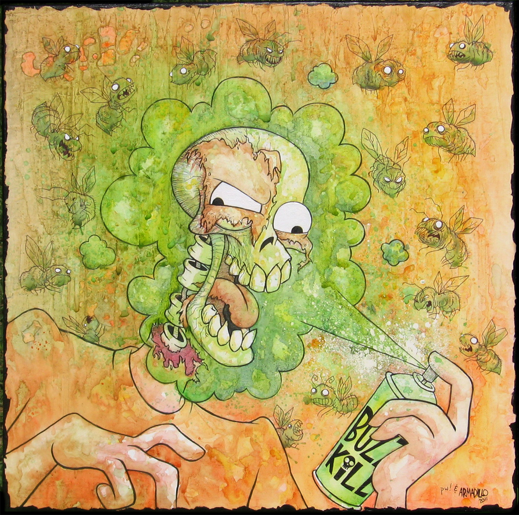 you can see some of his art at inkandpaindept.blogspot.com
  As Boston punks Have Nots unleash their 2nd LP "Proud" to the masses, they are preparing to hit the road with some new shirts and merch for sale!

 i keep a special sketchbook given to me long ago containing work from a very unfinished series. i hope to finish it someday, and perhaps even share it.


 I can hardly believe it myself. Very proud to be involved in both comic books as well as once again having an opportunity to make art for children to hopefully enjoy. There are a lot of extremely exciting things in the works, both Strawberry AND non-strawberry, but I still can't share them all just yet. Rest assured I am busier than ever, grateful as always, and looking forward to it all

 be sure to see the band on tour throughout the year, hear some songs, and find out more HERE or as always, at PaperAndPlastick.com
 i can't believe i haven't posted this sooner, but a short while back, my friends at the amazing Pnut Jewelry asked me to come up with a shirt design. head over HERE to see the generous write-up on it, and please order a few for you and your sweetheart! Sarah and i have our own, and i am telling you, no bull or bias, they came out Fantastic, and on the Nicest shirt material too. the attention to quality at Pnut reaches beyond the exceptional jewelry and into every aspect of everything they do.
 the above was a four foot banner at an exciting and exclusive jewelry show in CA. always fun (and a little intimidating) to work that kind of scale, and Debbie and Rusty are the absolute greatest to work with. I had some extra fun re-drawing the chord in my convoluted roller-coaster-ride-for-the-eyes kind of way
 I was lucky enough to have reworked the art for the 12" vinyl release of "serf city" from Boston's Have Nots, and we had so much fun working together they honored me with the task of bringing the vision of their upcoming full length to life! believe it or not, this has been in the works since last July!
 band member Jon Cauztik sent me the above photograph last summer. It's of his father who passed away, and the music and lyrics wrestle with this a great deal. the name of the LP would be "Proud", in the hopes that his "old man" is listening with pride, and for good measure, the Have Nots have really turned up the volume for this record. they wanted an LP that reflected everything they were going through and singing about; be it life, death, politics, love, abuse, traveling, and everything in between. my number one goal was doing not only the music justice, but also a very powerful urge to honor the father; both as the man who had passed away, as well as the boy in the photo long ago listening on his headphones.
 one thing i couldn't wait to do was finally get an opportunity to play with some textures i had been stockpiling! both of us avid fans of old records, my good friend, designer Jiri Seger, has taken me to some pretty great places in NYC to hunt down dusty treasures. one day i collected armfuls of only the rattiest, filthiest, most stained and aged record sleeves available, and the shop was all too happy to be rid of them. i scanned each gorgeous archeological find in 4 pieces each, and then reassembled them in the computer, biding my time for the opportunity to use them in a meaningful way.
 the above version was one of the more refined starts. here, i was thinking of the way sepias and colors (water & pencil) were once applied to old photos, and i imagined that the old colorings were somehow merging with age. Weathering with time to symbolically color the photo itself; each color represented something else in the picture. It was also important to me to imagine that despite the record not being available until 2 months from now, one could imagine unearthing this vinyl treasure more like an artifact of a previous generation or two.
  with direction and input from everyone, we tweaked and toned everything and continued the whole "gatefold" design. I really wanted it to look like an old sleeve with the photos on top, and somehow typed on, and then left over generations. (if you look hard, you may even find a strand of my fiancé's red hair between the layers). Everyone between the label and the band was so amazing and enthusiastic every step of the way
 the inside of the gatefold is the band's tribute to their home, Boston, and evokes all the themes of traveling, both leaving and arriving, witnessing of and missing out on, contained within the music itself
 for an insert sleeve to contain the record itself , we thought we would continue the idea of old photo albums with each song imagined as an important news-clipping from yesteryear.
 again, feel free to click these for better views, but here you can get a more detailed look-see. i had painstakingly combined layers of regularly evolving liner notes & lyrics with old aged papers i had also assembled over time. each clipping contains pieces of at least 3 different papers. once the text was placed and destroyed accordingly, i remembered to faintly show the transparent markings of the writings on the other side, not to mention occasionally distort the text wherever the wrinkles and creases deemed appropriate.
  this is actually an oldie (but goody) for my good friend, artist & publisher extraordinaire, Mike Collins at Tiki Machine. It is a pin up for his comic book epic "The Destiny Gauntlets", for which i was lucky enough to have gotten to do the logo for as well last summer. I chose his character Ghavin, Giant Warrior and Child of the Flame!
  Coming to a city near you! "Ska Is Dead" Presents: The "Young Guns" Tour, featuring We Are The Union and The Forthrights! Find more info HERE! and don't forget to buy some cool new shirt designs HERE (or on tour)....
 Reed, Jimmy, & Dave were amazing to work with, and i'm so glad to continue an awesome friendship with We Are The Union. Every second i worked on this poster was a blast for me, and i hope to get to do a whole lot more like it
 Happy New Year everyone! I know things have seemed quiet on the eastern front here, but that couldn't be farther from the truth. But until i'm prepared to announce some big things, i got some exciting news & kind words today... the new Make Do and Mend LP came out, and everyone is excited about it!


 Posts
All Comments
Posts
All Comments


