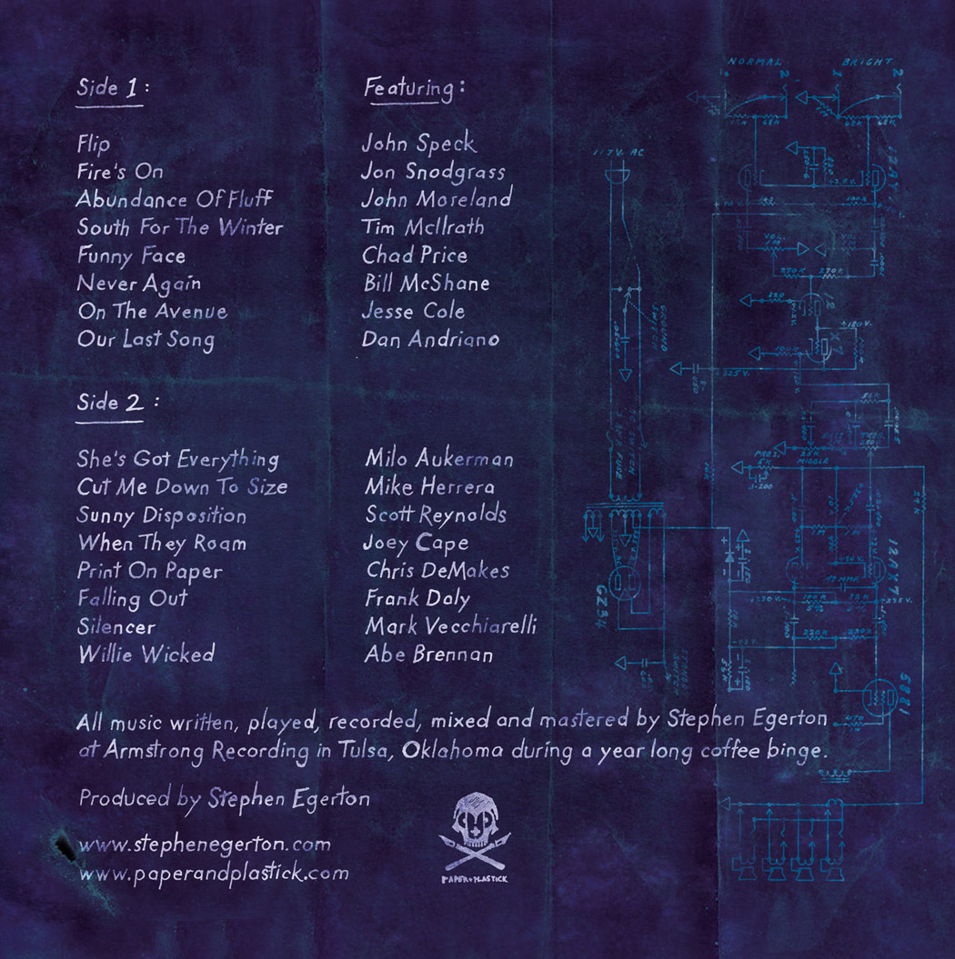
Wednesday, June 30, 2010

"House of Ideas"...call me!

(click for larger view if you like)


this was a a ton of fun doing per my nephew's request (and birthday), as if i was pretty much waiting for an excuse to draw an all time favorite character: the Silver Surfer (although, Mr Fantastic was a blast to work with too)

Tuesday, June 29, 2010

Layout

so in addition to getting to do a lot of illustration, it's also a lot of fun to work with other people's artwork and ideas. Paper+Plastick is always releasing great records by great bands, and sometimes they already have great art that just needs some layout work. it's excellent exercise for me to stretch my design muscles and reconfigure pieces of a puzzle into a cool looking record that is unique to each band, and especially because design is a rather weak area of mine that i would really like to have a better understanding of

here's the fantastic full length from Boston's Have Nots, who are super awesome to work with. i'm actually very fond of this, even though another great designer pretty much did all of this already for their CD, i got to bring a tiny percent of myself to the table :

this is an EP for Let Me Run, featuring stellar artwork by Dave Quiggle!


and in the following, The Swellers had their new album's layout (on Fueled By Ramen) all ready to go, but for the vinyl release, P+P wanted to give them that extra bit of awesome, and i was kindly asked to do some hand written type! always a labor of love, and always, in my opinion, worth the extra work and attention

it starts of course with the band sending me the lyrics in a live text document:
i take their words as they've written them, and lay it out in the LP's insert template to make sure it all fits nicely. once i know where the pieces are approximately going, i start writing it out. it ends up like this (feel free to click for a larger view if you like):

phew! the goal was for the writing to look like someone carved it into the wood with a knife. i kept a mean hand and a tough wrist and a day later i inversed the colors and voila!


Monday, June 28, 2010

MVD Man!


My good pal Clint and MVD Entertainment Group needed a simple mascot, and this was a fun quick job in a fun clean style

the sketch:


some primary colors:

Sunday, June 27, 2010

back in the Toy biz...

my good friend Clint at Aggronautix has been paying tribute and causing mayhem with his Throbblehead collectibles, and recently i got to work on the Andrew WK Throbblehead, on sale now on his tour and through Aggronautix! check out an article about it HERE on Limewire (with my illustration)! Andrew is a super sweet dude, was stoked with the work everyone did, and even signs his e-mails "love Andrew".
i even get my sketch on the packaging, with an artist credit, Thanks Clint & Andrew!


keep your eyes peeled for other fun projects in the works!

Sunday, June 13, 2010

Clowntastrophe!

well i never thought i would do, or get to do, a Circus Punk, but here it is!

recently the indomitable Paul Palcko asked me and a whole lot of other talented artists to be part of his annual Clowntastrophe art show at the absolutely dynamite Delicious Corsets Boutique in Philadelphia! it's going to be a carnival blast, complete with sideshow, performances, great artwork by Paul + 30 other local and national artists, and even discounts on all Delicious products. Read all about it in the paper HERE!

although Paul's paintings themselves often have layers of commentary or references to them, i like his quote that "I see life as a circus, and all of us performers"

My "Circus Punk", traditionally a hand painted doll used by in carnival "knock down games", definitely shows the fun frivolity of life. the flame in his mouth is laughter, as no subject is beyond its overwhelming power of perspective. he is making a squeaky balloon skull, because i think about death not out of morbidity, but with the same affection i have for life, not merely as the other side of the coin, but the weight in the scales that makes life's lofty balance an exhilarating thing. i think that life, laughter, and death, have very close correlations, and in no way undermines the seriousness of the subjects.

if you can't make the show this Saturday June 26th to see them in person, check out the group blog HERE. below are some details, please feel free to click on them for some major close-ups


Saturday, June 12, 2010

The Unkissable Pile Of Intestines


hello! several moons ago i was an animation minor at the University of the Arts in Philadelphia. Animation was always my first love and i long to get back into it someday, and wouldn't dare rule it out for future outlets of ideas.

Well the kick in the pants to that dream was my friend and old neighbor Kristoffe Brodeur rediscovered an old film of mine, dusted the file off, and uploaded it to the internet! Kristoffe is a renaissance man himself in dance, electronics, film, multimedia and beyond, and you can see more of that HERE. he literally had an open door policy where we lived, and though i had actually made 2 "unkissable pile of intestines" shorts prior, he offered to go over the new one with me and completely upgrade it into something special. editing, sound, special effects, and more were given his thorough, knowledgeable, enthusiastic, and profoundly generous time and touch. Thank you Kristoffe!

"The Unkissable Pile Of Intestines" first showed up on a wall me and some fellow tenants and Spiderbiters once marred, and he became my everyman mascot of the unrequited. his previous appearances, though a decade old, and future adventures, will see more light here in the future. until then, enjoy:

Tuesday, June 1, 2010

Homebase Skateshop


wow, where to begin? Homebase Skateshop in Bethlehem PA contacted me a few months ago to help them come up with a few graphics that would help raise money to build the Bethlehem Skateplaza. Having spent a some wonderful times (sneaking in the middle of the night) at Philly's FDR skate park long ago, i know first hand what a great thing this could be for a community. Andy Po who runs Homebase is doing a lot of incredible things at his shop and for his town, and all for the right reasons.

first up (besides the above logo/patch), is the commemorative skate deck sponsored by 5boro, red bull, and Dan Pensyl (who has a "real talk" tattoo, which makes him double awesome in my book), and the board was used to raise money to continue and complete the skate plaza. the bottom of the board was meant to reference Dan's first famous skate deck for 5Boro (with existing Bethlehem landmarks, and soon-to-be-monument Skate Plaza, in place of the original Manhattan graphic). the bottom of the board, though eventually covered in grip tape for shredding the park, would tell a little about the collaboration between everyone and the good cause in purchasing the board (click to enlarge if you like!)

if that wasn't monumental enough of an occasion, Homebase just celebrated their 8th anniversary! they were kind enough to ask me to do up a few t-shirt designs to keep helping raise money (feel free to click to enlarge)
though the following design didn't get used exactly, i was kind of proud of the clever playing around i did with the 8 and their logo (although only Andy knows that originally, i got the roman numeral completely wrong to the point of fictitious)


here are some photos from this weekends epic extravaganza:

check out them shirts!
Andy works the crowd during the skate deck's unveiling:
Andy Po and Dan Pensyl
Congrats Homebase!

also, special thanks to Bethlehemite and friend Marty Desilets for pointing me to these photos. Marty is one of the kindest, most generous people you will ever meet (and congrats to him and Dee on their recent engagement!), but if you never meet him, then you should know he is also one of the best photographers i have ever seen. you should check out his work HERE

folks like Marty, Homebase, and Vegan Treats are arguably greater monuments to Bethlehem than the steel factory or the Bethlehem Star.

there must be something in the water there

and happy June 1st everybody! hope you're all off to a great summer

Friday, May 28, 2010

Pigtails & Pixies LOGO

recently i was asked to help design a logo for "Pigtails & Pixies Bowtique", custom made accessories for head to toe, specializing in hair bows (and tutus) for little girls.

you can see Erin's amazing work on her BLOG, and you can always buy lots of great products for the little ones in your life at ETSY or ARTFIRE

some fun first tries:
(you can always click for larger view if you like)


the final "banner" i made looks a bit like a clothing tag.
i had fun playing with the dotted line in stitches and cartoon flutters:

add glitter...


Thursday, May 27, 2010

Derek and the Darling LOGOS

i don't know how i'm always lucking out working with the nicest people ever, but NYC's rock n' roll dance outfit "Derek and the Darling" presented me with the fun challenge of helping them with a new logo as they embark on tours and record releases all this year.


I wanted to find them something clean, sleek, and smooth to both match their style (as well as avoid anything looking too dated in a year), and something that would be fun and modern (but referenced their music too), not to mention match the enthusiasm of their personalities.

i believe in options, something i've been told is a bit of a designer no-no. sometimes i think it may be my lack of confidence in my design skills or sensibility, but other times i know that i'm the kind of person who can tell you what i don't like before i can tell you what i do like, and most times i have to see it first anyway. i think a lot of folks are like this, and the bottom line is, if i'm going to honor the compliment of being asked to work on something For You, i'm going to make sure it's done For You. i know it's supposed to be "up to you as a designer" to fine tune and craft a vision, but it's not entirely my decision is it; i'm just an interpreter and vessel.

i like options, i love exploration, and i'm all about collaboration with the client to give them something they will be a million % excited about. i've worked at companies that didn't care enough about the customer, client, or product, and the end results were never great, and never ever long lasting. so here i tend to bombard folks with a ton of (appropriate) typefaces first, thinking of them (and rocking out to their music) the entire time, and we narrow it down quickly and collectively. we start wide and chop 90%, and then dive into the details, where i tend to thrive. we actually staid pretty true to the various typefaces and pictorial ideas, with only minor tweaks to match the same precision their music has. here are just a few:


in the end we took a crucial roundabout journey to come back to a place where we started, wiser and more fine tuned than before! you can see how they used their new logo on FACEBOOK as well asMYSPACE, and of course on tour and on record now!

Monday, May 24, 2010

Death Gospel


yes indeed you may have heard pieces of Adam Arcuragi's rousting hootenanny "Bottom Of The River" on TV recently (that's me playing harmonica!)

congrats to Adam and the entire Lupine Chorale Society!

now get out there and see Adam LIVE (because he is amazing live), or head over to High Two Records, or wherever fine music is sold, and grab a copy of Adam's live-take, feel-great, long-player: "I Am Become Joy". we all enjoyed making it, we know you'll enjoy listening to it


Friday, May 21, 2010

oh boy! new records!

and they came out great!


for the record:
1) Paper+Plastick Records is one of the best things to happen to music. period.

2) Coffee Project are two of the coolest dudes ever, and i'm SO proud to get to be a part of what they are doing. their show last night in NYC at The Silent Barn knocked my socks off, and their excellent new songs are full of so much heart-tugging & humor. you really need to see them on tour, as intimate a setting as possible, and be simultaneously spellbound and pumped by the cleverness of every aspect of the songwriting. Their first full-length LP "Moved On" is OUT NOW!

3) The Blacklist Royals bowled us all over. spirited, rebellious, & passionate anthems as heavy and driving as the motor on a '59 Buick Electra (you can hear some HERE). such rad generous guys too; really appreciated getting to spend time with them, and now triple-proud to have gotten to work with such a great band

4) Greenland Is Melting. phew, i was not ready. the most passionate bluegrass music you have ever heard. like the sweetest honey drizzled over your first heartbreak. i didn't get to do any art for them --- because the amazing Shaun Pereira did (and you have to buy this LP and unfold it's vertical Andrew-Wyeth-meets-Steadman+Burton glory)! head over to P+P HERE to download the record FOR FREE if you don't believe me. you'll be giving them your hard earned whiskey money like i did. have i mentioned Karl, Will & Shaun (whose name i misspelled on my card, sorry) are the nicest guys ever?

-------------------

Zounds! check out this great tour video from Jake & Buddy, and the super nice shout out they gave me towards the end! this gives a great snapshot of one of the best shows/nights ever! (why, that's even my noodle on the bottom right of the preview!)

Friday, April 2, 2010

the Seven Degrees of Stephen Egerton!


i just got to work with renaissance man Stephen Egerton, known especially for his influential guitar work in The Descendents and ALL ! In addition to being one of the nicest guys on the planet, he recently wrote and recorded a record at his own Armstrong Recording studios, and he has a real 'whos-who' of punk rock all stars doing guest vocals (we're talking The Descendents, ALL, Alkaline Trio, MXPX, Less Than Jake, Big Drill Car, Rise Against, Ultimate Fakebook, Lagwagon, Shades Apart, Drag The River, and way more! phew!)

The album will be out proudly on Paper+Plastick Records May 11th, with what i can only imagine will be one of the coolest record release shows ever (with vocalists confirmed) May 14th & 15th. The LP will feature Stephen's logo, designed by the awesome Eli Atkins, as a die-cut window !)

i don't think i have to tell you how excited i was to be working with Stephen here.
legendary!


(all type done by hand)

Monday, March 22, 2010

Coffee Project

so Paper+Plastick's COFFEE PROJECT (featuring members of Less Than Jake & Rehasher) asked if i would do the art and layout for their second record, and what a compliment to be asked a second time!

they said they wanted "Peter Wonsowski meets Dr Seuss"; how great is that to hear?!? and of course i love that my job includes a morning reading 7 of my favorite Dr Seuss story books for, you know, "reference" (not to mention my trip to the book store a Tax Write Off !)


the following were rough thumbnail sketches, to determine what kind of perspective we wanted


followed by some quick fleshing out before i dove into the exploration of the final


and since many drawings would be of actual band members, guest musicians, friends, and such, i drew pages of quick caricatures to get decent stylized likenesses. Here's Jake:


and the first [el Greco] version of Keeth, their friend (and parade's pied piper)


the Final Art (type and layout still in progress)
PLEASE CLICK FOR LARGER VIEWS !


DETAILS:

i can't tell you how excited i was to do a complicated crowd scene. i wanted to make sure that there was always something fun look at, and i refused to oversimplify any bodies in the background. thankfully the divine format of a gatefold vinyl allows for 24"x12" to enjoy

(so feel free to click for larger views!)


i'll let you know when it's available for purchase, especially on Coffee Project's tour this spring/summer !
thanks!
-peter