Friday, October 22, 2010

The FEST 9 !!!


THE FEST, now in its 9th year, is the 3 day punk rock festival in Gainesville Florida, and every year it just gets better and better

well, this is the 2nd year that the Fest will be curating a special Art Show to coincide with all the rock and roll mayhem, and i was honored to be asked to be one of the featured artists, among such an incredible group of amazing pioneering punks, photographers, designers, and illustrators such as John Dyer Baizley, my good buddy Richard "Horsebites", social storyteller Cristy Road, and so many more amazing artists.

read all about the art show (and peruse my awkward bio) HERE !
read all about the FEST 9 event HERE

if you live in or near Florida, the fun starts Friday October 29th!

i am showing a dozen pieces, including the interior art for the Riot Before's LP, as well as 3 little cartoons made exclusively for The Fest....


special thanks to Edie, Ted, and Buddy for thinking of me to be a part of something this special

Tuesday, October 12, 2010

Less Than Jake presents: The TV/EP !


(feel free to click for larger views if you like)
Today is the official release day for Less Than Jake's TV EP ! it is still a blast getting to be a part of the visual history for a band that very much influenced where i am today and where a lot of my creative and professional passions lie.

When the band went to record 16 cover songs (in 11 minutes!) from various television theme songs and commercials, they wanted to give the impression that pop-punk has taken over the air waves and you are randomly flipping the channels.

that being said, we've engineered a very special collector's edition 7" vinyl record (to go along with the CD and the digital, available now) where, depending on how you fold the panels of your record, you will actually be able to "change the channels" and determine your own cover through a die-cut television screen!

channel 2....
channel 3...
and the "inside" of your tv (with some fun filaments)...

it's a strangely proud moment for me personally, when there are plenty of people who make me doubt my versatility as an unmarketable product, that there can't be a whole lot of folks who would've excitedly tackled all the visual parodies and styles the band asked for here. it's another reason it makes our long friendship and these kinds of projects so especially meaningful.

check out the whole EP (with a great video Buddy made) at LESSTHANJAKE.COM !

pw!

Saturday, September 18, 2010

The Swing (An Old Fashioned Necromance)

(click any image for a better view)

This Hallowed Halloween, The Autumn Society and Philadelphia Cartoonist Society, curated by the amazing Sam Heimer, bring to you an incredible artist exhibition "...exploring all the elements that make Halloween creepy, imaginative, and fun." (check out the full Press Release HERE!)

pencils
and yes, i couldn't resist the urges to add some glow-in-the-dark flourishes on the tentacle suckers for extra fun spookiness...


here's the info! we hope you'll join us for an amazing Hallowed Halloween!

Friday, September 17, 2010

Coming This Fall To A Stereo Near You...


what's the amazing secret project i've been working on coming out in
Less Than a month?

well you can get a hint HERE, but you can read more about it HERE

you won't believe what we've done with the packaging! thorough blog post to follow around the release date....

-pw!

Thursday, September 16, 2010

design money to raise money

(click for larger view)

above is a raffle ticket designed for the amazing Homebase Skateshop in Bethlehem PA. with each purchase, money is raised to complete the next construction phase of the Bethlehem Skateplaza, and you can win a $610 shopping spree!

it was a lot of fun being a counterfeiter for a little while!

Wednesday, September 15, 2010

Mixtopia Logo


new logo for radio B104's MIXTOPIA show, brought to you by "your hater's favorite DJ", Cap Cee, every friday night from 9-12 on your favorite dance floor.

some preliminaries:

the final:


Tuesday, September 14, 2010

Vegan Treats Gift Cards

the perfect gift for the sweet-tooths & dessert-lovers in your life, Vegan or carnivore, so one size really does fit all


Monday, September 13, 2010

Exquisite Corpse

this was a blast!
if you're not familiar, the game of The Exquisite Corpse was started by the Surrealists art movement, wherein someone would draw one part of a body, cover their third (and extend the lines connecting segments) and pass it on to the next person to blindly continue, cover, and pass on. no one knew what the creation would look like until the very end

our good friend, obscene talent, and crazed renaissance man in California, Ryan Gannon has been doing loads of these with friends, but it was a thrill to do one with both Ry and the legendary Justin Gray. it really harkened back 8-10 years ago making mischief and artwork in our UARTs studio together, and was a small, fun, reaffirming testament to that kind of creative collaboration that ignores geographical separation.

below are links to their sites that come with the absolute highest recommendations to click and explore.

torso - JUSTIN GRAY

Tuesday, September 7, 2010

who you gonna call?

it doesn't get much better than this


what else is there to say? Ernie Hudson next to my painting of Ernie Hudson!

Tuesday, August 17, 2010

Call Winston!

Ghostbuster Winston Zeddemore (Ernie Hudson) for the 3G Show at Gallery 1988 in LA (7020 Melrose Ave. Los Angeles CA 90038).
(click for larger view)
There was never any doubt at any time, I was always going to pay tribute to the great Ernie Hudson. I have been a huge fan of his since his portrayal of the under appreciated Winston, not to mention his heroism in "Hand That Rocks The Cradle", and especially his role of Warden Leo Glynn in OZ. But Winston Zeddemore is a special guy to me. When applying for the job that everyone thinks is such a coveted thing, they ask him if he believes in a long list of paranormal oddities and supernatural wonders. Winston simply replies, "If there's a steady paycheck in it, I'll believe anything you say"

I can relate to him on a lot of levels there... so this one's for Winston, and more so, for Ernie

say, did you notice any strange slime on the painting above? that's because it's glow-in-the-dark paint. hard to take a photo, but i detailed the ghost as well as all the ghostbustin' equipment

Z for Zeddemore
(special thanks to Joe Game and the rest of the Autumn Society for letting me be a part of such a great show with such talented individuals, and to Gallery 1988 for allowing us to show)

-------------------------

UPDATE:
well it's only been on line for a day and the bloggosphere is exploding! it seems some folks are really excited about the show too and it couldn't make me happier! here are some amazing links to checkout:

slashfilm (gave me a nice quote too!)
blast-o-rama (said: "What’s my personal favorite of the show? That “Mogwai” LP is amazing, hands down."

some great blogs:

Rampaged Reality (called it an "Ectoplasmic Masterpiece" !)
Hello Zombie (says it's "kick @$$" !)
The Kessel Run (included a hilarious Zeddemore quote)
Zuppa di Vetro (is in Italy!)

Wednesday, August 11, 2010

good enough for goonies


for the 3G show at Gallery 1988 in LA !

this was my piece for the Goonies. not a film i cared about in youth, but watching it on the Balcony at the Trocadero in my 20s, when Mouth delivers this - one of the best movie speeches -i wanted to stand up and cheer


Tuesday, August 10, 2010

the Gift of the Mogwai

howdy!
this spetember i will be a part of the incredible 3G show at Gallery 1988 in California! it's a great space that houses big names in the art world specializing often in retro homages. it's a great opportunity for me and bg deal to be asked to participate. i've been so excited about being a part of this incredible show, but, long story short, it has come during a time of great artistic (and professional?) turmoil as i muddle through the cliches of "what am i doing" and "should i just throw in the towel" etc etc booh-hoo. point being, my pieces for the 3G show aren't typical for me, at great risk (comes great failure), but i used each film as a jumping point to try something drastically different (from each contribution as well), and despite my hesitance to submit them, at best, they really have pulled me out of a hole and helped me get my groove back, and for that i am eternally grateful.

when i think of Gremlins, my first thought is of Mogwai, the name of inarguably the most influential modern instrumental post rock band from Scotland. since my first love, pipe dream, and bulk of current freelance work is elaborately packaged vinyl records, i thought, "wouldn't it be awesome to make a fake record for Mogwai?"

i actually went on ebay hoping to score a 7" from the Glasgow mega-snakes, and in turn actually found TWO story book records from childhood of the film in question! even better! my goal was to pay tribute to the incredible and adorable keyboard scene, as well as pay homage to the gestural illustrated blue-note jazz LPs of the 50s and 60s, using only colors found on a Gremlin

here is the "final" inside its plastic sleeve:
the back:
and the inside, which contains a bonus abstract Gremlin made of felt to safely house the precious vinyl tales of the Gremlins, as well as add some tactile feedback to the whole experience:
the labels, as they are, with far better illustrations than i could do:
the entire package will be spread out and in display in a frame specifically made to eventually house a 12" LP. the idea being that if someone purchases it, they can, and should, remove it, play it, and house it in their own record collection, AND have a frame they can use for other vinyl treasures. that the art comes from removing it all, constructing it, enjoying it, experiencing it, and doing more than just tacking it on the wall

Thursday, August 5, 2010

the Riot Before LP !

an amazing day for mail (thanks Vinnie, and thanks Dave at No Idea)! The Riot Before LP came out absolutely smashing. sometimes you wait for months nervously, wondering if everything is going to come out manufactured ok. late nights staring at a ceiling thinking "will the double window die-line line up to reveal correctly?" or "will the CMYK vinly labels on the lighter paper be too desaturated"? i'm going to be a wreck if i ever have kids. but it came out marvelous. Paper+Plastick continues to reach for the stars and then some, and Walt and the fine folks at iloveimprint.com know how to get it done beautifully.

wouldja believe they sold out already? not even out three months! they're getting repressed though, so worry not, you'll be able to get them in all their color variations soon. be sure to check out The Riot Before in a town near you!

(closed)


look! a movie of it opening! thanks Whetzel!


and if'n you missed it, i had a lengthy post with more of the artwork to look at HERE

-----------------------------

UPDATE:
how nice is this!?!? Brett and The Riot Before have been giving all sorts of interviews since there's been amazing reviews and well deserved acclaim since the record dropped on April 27th. they were incredibly kind enough to even mention me in their interviews in Punknews as well as Beyond Race !

here are some excerpts:

So this is your first record for Paper and Plastick, did you guys go all out on the vinyl? Can we expect some surprises?

"...The artwork itself is amazing-because someone else did it. Specifically, Peter Wonsowski. He was incredible to work with and was like Gandhi…patient with me when I'd give him really really vague direction and then change my mind. The artwork rules. Get the record, if anything, to look at it."

(and)

How do those themes fit into the rebellion cover art Peter Wonsowski created?

"I wanted the punk rock per se to be the cover art. I was reading through Dostoevsky
The Brothers Karamazov. There was this chapter called “The Grand Inquisitor” I was rereading last March and the chapter before that is called “Rebellion.” ...And when I did I stumbled across this quote that said, ‘One can hardly live in rebellion and I want to live.’ And that just struck me super hard because I’m 27. I feel like there is a certain part of your life where rebellion is really necessary, you have to throw away everything you once knew and you’re rechecking stuff. It’s a really an important part of growing up. But at a certain point you just can’t keep rejecting stuff and you have to figure out what you’re for and I think I am definitely at that point."

-----------

How awesome! first time my name has been part of a Question! very exciting, thanks everyone

Monday, July 26, 2010

The Silent Ballet

(please click for larger view)

this was a pretty big deal for me.
For years now, The Silent Ballet has been devoted to writing, reviewing, exposing, and celebrating the best in instrumental music in all its many splendored variations (classical, ambient, post rock, experimental, electronic, etc). part of this includes curating some of the best, often underrated or unsigned, instrumental artists to be a part of their free downloadable compilation series

well, i was contacted by them to submit a song, a very humbling and left field honor, to which my response was "could i also please do the artwork?!" Jordan was gracious enough to encourage me to stitch together an exclusive mix of 3 songs (since they are short, as i like to improvise "ambient soundtracks for short attention spans), as well as let me create the original art around my feelings towards ambient and drone (the loose theme of this 16th volume in the series):

if percussion and punctuation is a dot, then at first i wanted to explore the resonance and space between the points, to "represent the others implied" (hence, the ambassador etc. moniker). later i wanted to extend that dot to create a line, blurring points of origin or reference. now i wonder if it is possible to make points radiate outward, like a dandelion made of layers and walls, waiting to be wished upon and blown, and lost to the dense fog of 'gorgeous noise'. i am very proud of the final result, a comment you will almost never hear me say, perhaps because my motto of letting the 'Idea Dictate the Medium' pulled me in such a strange direction

you can download the record for free HERE.

you can read more about ambassador etc. HERE, or listen to a few more tracks HERE

special thanks to one of my greatest and oldest friends Jiri Seger, who encouraged me and bettered my sensibilities with "If you're going to do it, do it all the way." you can see more of his incredible design, and get to know him, at jiriseger.com

thank you for looking and listening!

Friday, July 23, 2010

The Destiny Gauntlets!

(click for a larger view)

the amazing (and patient) indie publisher Tiki Machine, LLC had gotten in touch with me (courtesy of one ambitious and generous Joseph Game) to see if i would be interested in doing a logo for his epic fantasy comic book series "The Destiny Gauntlets". At the time i was finishing up a logo for an electronic dance group and a boutique that makes hair accessories for little girls, and this was just too wild to pass up. i mean, a trio of simultaneous logos don't get more different than that (i just had to be careful not to confuse these worlds by giving a butterfly a battle-ax or a viking a keyboard).

Mike gave me some special sneak previews of art, story, and characters, and we went back and forth looking at countless typefaces, book covers, comics, and logos to come up with just the right look for the book and exactly what he wanted. below are some roughs to see if shape was worth exploring, followed by some rough, classic-but-modern, illustrative letters


we knew we wanted "destiny" to look magical, and "gauntlets" to be battle damaged, and soon we were getting closer. i actually kind of like the smashed "gauntlets" on the top version (below). below that you can see one of many attempts incorporating pictorial elements in the logo, and though it bums me out when i can't succeed in the challenge of making something work, i'm still glad we tried it.
and below is the final sketch! i'm fond of this one; it was a real joy for me to draw letter forms so thoroughly. you can't imagine how much penciling, erasing (SO much erasing), measuring, flipping, following through, and exploring that goes into this, and thank heavens i am all too excited to go on that journey.

(feel free to click on for larger view)
and a spruced up black, white, & gray version. i always go out of my way to ensure that all logos have shapes and forms that would work as solid black on white, even though we knew that by the end, Mike's logo would have plenty of eye catching effects and renderings (see final up top).

Mike has been generous enough to give me a nice credit on the inside cover of every issue (i feel like Kevin Nowlan on Hellboy!) and there's even a chance at a pinup in the book itself! rest assured i'll let everyone know how to get copies when it's published

thanks for reading!

Monday, July 19, 2010

SONY!

it is with great excitement working with SONY Music Japan and some of the amazing artists on their roster! They are hard at work bringing some of their talent to the states for the first time, and spreading the word on those who have already seen our shores. Here's hoping for more fun work like this in the future!

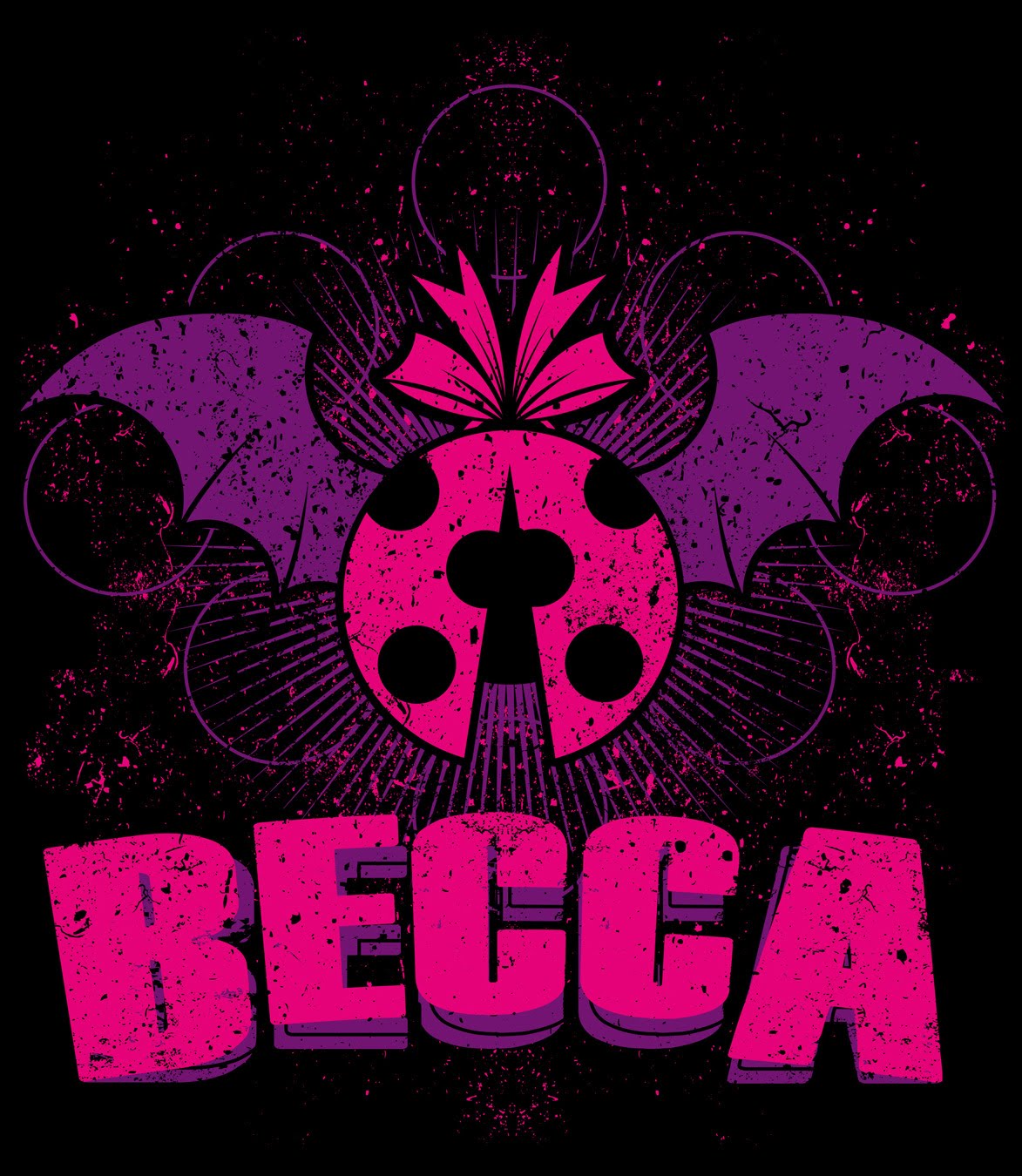
the first was one of several t-shirt designs for pop-star and super nice rock-n-roller BECCA!

and the following was a postcard design to be given out on tours, at festivals, and for promotion of these amazing musicians

it was a blast stretching my design muscles and being given such freedom to create and help SONY and their artists
thank you!
-pw!

Wednesday, July 14, 2010

Coatesville PA: terrible things

for a year, Coatesville PA was terrorized by a string of arsons, culminating in the arrest of 6 people, some of them firefighters, responsible for $3 million in damage, scores of homeless people, and the murder of an elderly woman.

you can read some basics HERE, but i also found it fascinating searching for psychology profiles on arsonists, including the taboo subject of how many are firefighters (though to be fair, there aren't exactly studies of how many arsonists are plumbers, etc), but worst of all, how some theorize the economically depressed Coatesville was victim of a type of gentrification through terrorism

Tuesday, July 6, 2010

Ποσειδῶν

"In July 2010, in America's birthplace of Philadelphia, 30 emerging young artist of diverse skill sets have enlisted their services in riding the waves of discovery in effort to provide new additions of pictures to provide visual dialogs of mankind's fascination with the sea."
--Matt Cavanaugh

ALL HANDS ON DECK
Opening reception
Friday July 9th 2010 7:00 PM - 10:PM
Chapterhouse Cafe and Art Gallery
620 South 9th Street (between south and Bainbridge)
Phialdelphia, PA
917.737.5055
-------------
Anthony Pedro of The Autumn Society of Philadelphia was kind enough to ask if i would be a part of the nautical themed show he was curating. Being quite a huge fan of Anthony's paintings, as well as my own affinity of the sea with its rich history and inspiring mystery, this has thusly been one of the most exciting group shows i have had the honor of being a part of. if you can sail on by the show this friday July 9th, or to Chapterhouse anytime at all this month, i can assure you a fantastic time marveling at the walls with these other talented individuals.
-------------
i was really trying to blog once a day for as long as i could, but our wonderful 4th of July celebration put a pause in my posts. i certainly have had enough work to keep it up for a while. however in celebration of the group show and in honor of Anthony's hard work, i'm going to make this it for the week. i thought i would also bore everyone to tears with some slight process description, as well as some trademark self deprecation throughout
-------------

when i heard "Nautical Theme", i just about lit up. i could do a nautical themed painting a day. i just about already have. a prized possession is a giant gorgeous oil painting of a massive old ship in pursuit that was given to my parents as a wedding gift. it hangs and encompasses the wall of the living room as a centerpiece. but what was i going to do here?

since i was a child i have always had a love and fascination for all mythology and folk lore, but as a young lad no book checked out from the library enthralled me like the big book of Greek Mythology. suddenly i knew i had to pay tribute to the mighty Poseidon, earthshaking lord of the sea and storms. Alexander the Great once sent 4 horse drawn chariots into the sea as tribute to Neptune and payment for safe passage of his armies across the sea. i would honor him by painting his terrifying visage with....watercolor

i tell lots of folks, especially anytime someone humbles me, or a finished painting, with a compliment, that "you should've seen the hundred awful drawings preceding that." you can take this as literal word when it comes to portraits or likenesses. below is some proof.

i wasn't sure how i wanted to portray the mighty god of old. mine is a love for the sea, but the old stories are full of horrors, sacrifice, and curious atrocities more in the name of explaining phenomenons, aiding anomalies, or encouraging forced piety, more than say, an Aesop's fable teaches a moral of some sort. for starters, i wanted to avoid common trappings that would visually precede me but pay some small nods as well (tritons, etc). so the start would be elder, powerful, and underwater. some awful fast explorations below:

i liked the idea of the tentacles enveloping and enwrapping him through the Grecian underwater beard (perhaps mimicking tentacles as well, though the hair would become more underwater flowing trident). more than anything, this would prove a fun visual challenge for me to intertwine elements. i mean, honestly, not to play it safe or phone anything in, but tentacles? check. beard and hair? check. old scarred face? check. pencils and watercolor? check. this was going to be right up my alley

so all i had to decide was 2 compositions i saw in my head. also, i wanted to challenge myself with some typography. Greek lettering is as bold as the columns of the Parthenon, and at the risk of no one knowing what the heck it said, i decided to attempt including it

i liked the symmetry for some reason, although it loses it's "massive" quality, but i felt i could make the tentacles a little more interesting and frankly intentional, instead of a mass of slithering tangles. the impossible symmetry there implied the kind of control over the sea and its inhabitants only the mighty Poseidon could possess


working it all out is always a blast for me; i can truly get lost in an exploratory daze. i also like to joke that i think i somehow manage to erase far more than i draw

on to the lettering. i loved the old Greek letterforms, but i began wondering about the secondary challenge of both spellings. like everything else in life, when ever i am face with a choice, i simply ask myself, "can i do it all?"

answer: kind of

finally, the finished pencil drawing! i have to tell you, this is the part of the process i am most proud of. if you have made it this far, and i thank you, if i could make one more request, it's that you feel free to click on the image below for a larger view. after this you can feel free to surf on elsewhere

(please click for larger view!)

i wasn't 100% sure where i wanted to take the painting itself. i suppose you can call this the laziest color study for a nautical piece ever:


i wish i took more scans of the painting in progress. i can tell you that over the course of days, tiny increments at a time, i softly rendered hair, coil, tentacle, wrinkle, scale, shadow and light, over and over again

then i slathered it in pigment, each time hoping to further Submerge it all below the watery medum
honestly, i just wasn't happy at all with it. i was no longer sure what i wanted, only that i didn't like it. i decided i wanted to add even more submerged depth to it all, and frankly, we all get that the water is blue or green, but could i give the tentacles more meaning? could i reference the sacrifice he demands? so i flipped the panting upside down and let the kraken bleed its ink upwards to the surface
of course i lost days of detail but at least i felt a bit more fearless. still, after framing, packing, and shipping the piece to Anthony for the hanging, i wanted to see if there wasn't something more i could do in the computer:
apparently, not a whole lot.

i priced the final painting at $56.27, a price no doubt i'll catch some flack for, because Poseidon fathered, on record at least, 56 children with 27 women, some of whom were not happy about that, though some of legend's greatest heroes and heroines were a result.

thanks for bearing with any or all of this; it's greatly appreciated. i hope you'll try to see the show if you can, or at least click on some of the above links, to see the incredible work 30 other artists created for this show

fair winds and a following sea,
peter